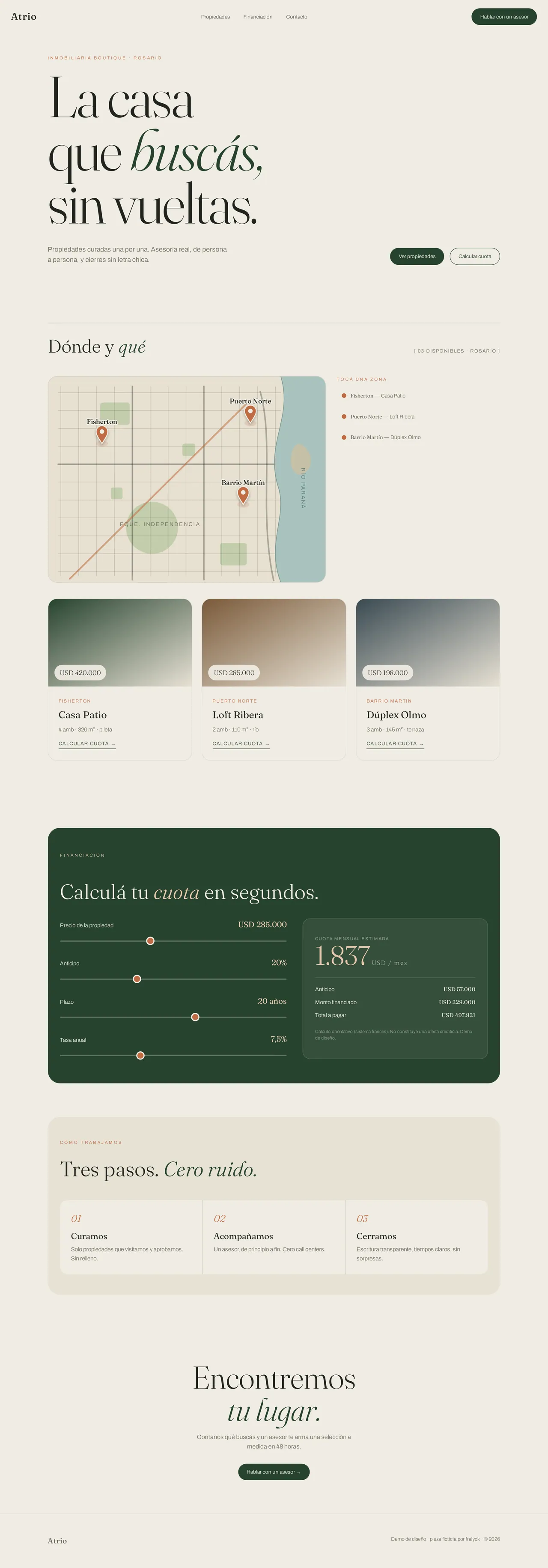
Atrio
Sample landing for a boutique real-estate agency. Editorial serif, forest green and warm neutrals: curated properties that feel premium.
The challenge
A boutique agency competes against saturated, cold portals. The site had to convey curation and a human touch — few properties, beautifully presented — and capture qualified inquiries.
The solution
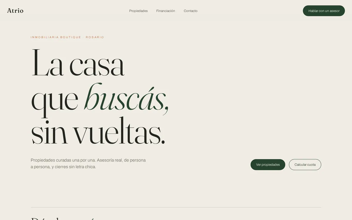
Large-scale serif type with accent italics, a bone-and-forest-green palette, clean property cards with the price up front and a three-step process that builds trust. Editorial, warm and straight to contact.
The result
A piece that positions the agency as select and approachable, far from portal noise. It shows how editorial design and clear hierarchy turn visits into inquiries.
Stack
Atrio is a sample piece: a fictional boutique real-estate agency built to show warm editorial design aimed at lead capture. Curation, trust and a clear path to contact.